Drawing the optimal plan for a studio or other flat
The lessons drawn from the simplest apartment can be extrapolated to larger areas.
These plans are in fact real cases of apartments that I had the opportunity to see. This goes from the worst to the best that consists in making the most of available space, but also in regard to the position of windows.
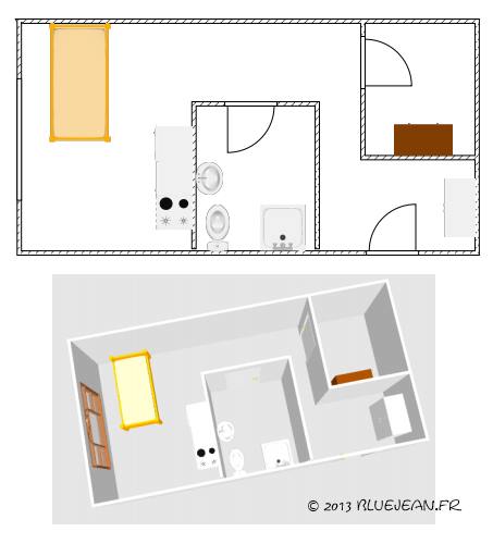
Let's start with the worst:

I do not want to condemn the architect who may have had some constrainsts about water inlet and outlet, but this is the worst way I could see for the use an area of 30 square meters. The bathroom is in the middle of the room so the living room is tiny and the hallway is a wasted space. A kind of office is on the right. I guess the trains passing near the building instilled the idea of creating a phonetically isolated corner to work.
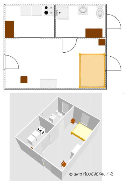
The second operates at best a rectangular space, taking into account natural light sources:

The kitchen is rather a kitchenette in fact, which takes the light from the main room by a sliding door that remains open when it is occupied. But I'll rather have placed it on the side of the window as it was done on the next plan.
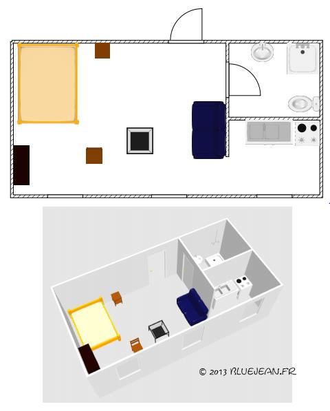
This one seems ideal in all respects:

Here the kitchen is separated from the living room by a half wall. This facilitates the passage while isolating the occupant when he cooks. The living room enjoys an alignment of three windows for a better lit and it appears larger. All cooking utensils are out of sight.
These plans were made with the free Sweet Home 3D software. Its ease of use will allow you if you want to design the home of your dreams.


